6 common PPC reporting mistakes that can make you look terrible
Your job is hard enough — don’t sabotage yourself by making these reporting mistakes. Columnist Frederick Vallaeys recounts common paid search errors and advises how to avoid them.
One of the most important elements of building a successful marketing career is to be a good communicator, and for PPC managers, that includes sharing insightful reports. At Optmyzr, my company, we generate a lot of reports on behalf of marketers, and we’ve learned a few things that might help you deliver better ones.
So here are five common reporting mistakes that make you look like a bad account manager, and how to fix them.
1. Reports sent too soon that always undervalue PPC
Reports you share with clients should show how good you are at PPC, but when you get overeager and send them too soon, you’re shooting yourself in the foot.
Due to the laws of physics and the space-time continuum, the conversion always happens after the click. In reporting systems, this means clicks (and costs) always show up before conversions (and sales value) so any KPIs using these metrics — like CPA and ROAS — start off looking terrible, and then gradually get better.
If your conversions tend to come within minutes of the click, AdWords may report the two events at approximately the same time, but if you have a longer average time-to-conversion, this delay can cause your reports to make it seem you are doing a terrible job.
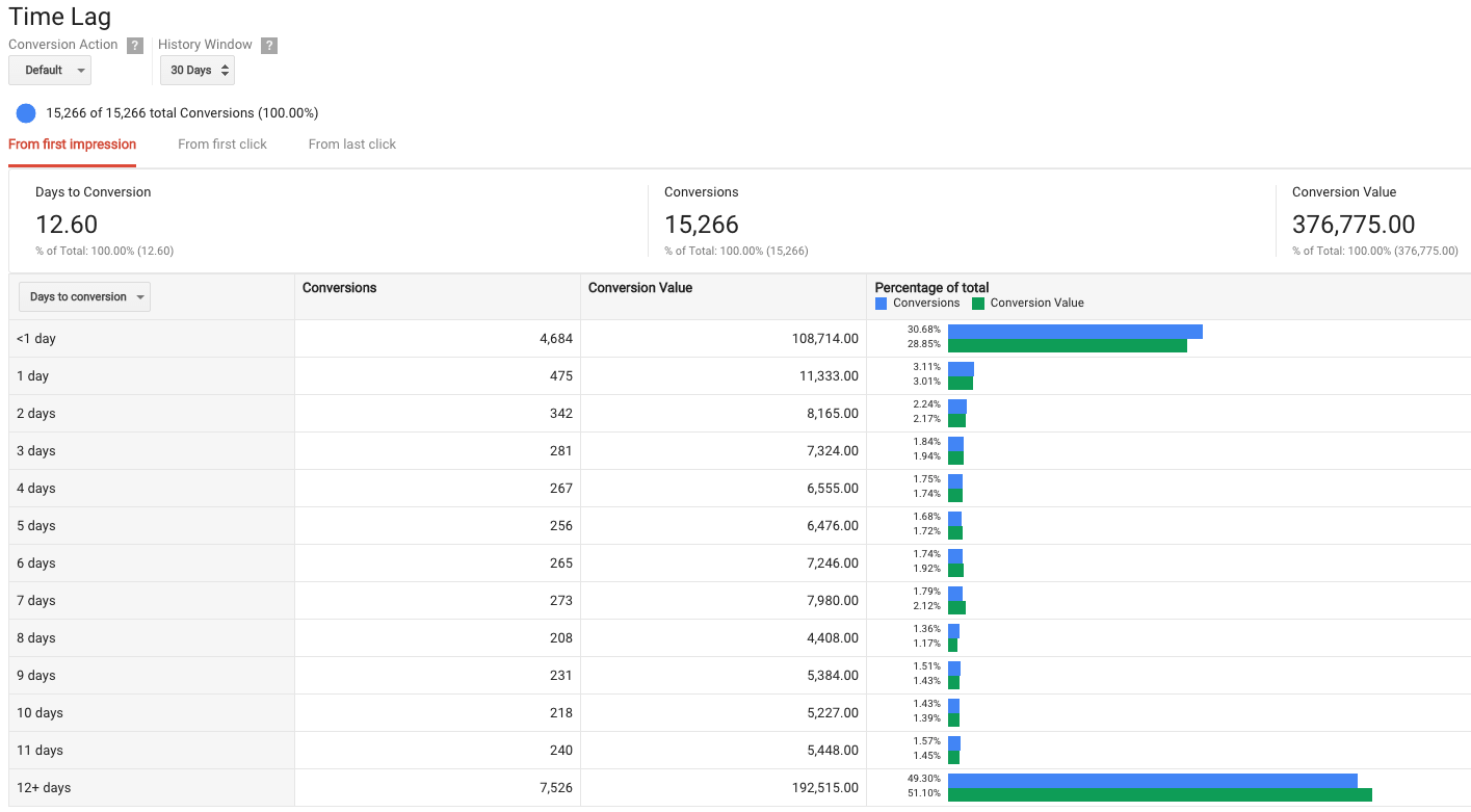
I experienced this myself while consulting for a client who wanted weekly status updates. Every time, he asked me why there were fewer conversions than for the same week last year. The answer was simple: a good percentage of his conversions, and especially the higher value ones, tended to take several days to happen.
By looking at the data too soon, we were always missing out on a lot of the value that would be driven several days later. I figured this out pretty easily thanks to one of AdWords’ standard reports for “Time Lag.” Take a look at this for your own data under AdWords > Tools > Attribution > Paths.
There is also a technical reason why reporting too soon can be detrimental. Data in systems like AdWords is updated piecemeal — for example, cost data and click data appear in AdWords in near-real time, but conversion and sales data can take days to appear if you’re importing it from another system, like Google Analytics (GA).
Conversion data from GA usually is imported in AdWords in nine hours, but due to the size of my client’s account, there was usually a 72-hour delay. So if I were to report last month’s results on the first of the current month, I would be missing three days of conversion data, undercounting conversions by approximately 10 percent (three days of missing data out of 30 days in the month).
The bottom line is that if you report on KPIs that include conversions too soon, you can only make yourself look worse, never better. So trade off quickness for completeness and wait a few days. The longer you wait, the more conversions will be accounted for, the more invalid clicks will have been filtered out, and the better your CPA and ROAS will look.
We see too many advertisers generating their monthly reports on the first of the month in our own tool, Optmyzer. We recommend not reporting the previous month’s data until at least the fourth of the month to ensure conversion data is included for all days.
2. Your visuals tell the wrong story
If you’re good at your job, your reports will make that clear to your stakeholder, usually in one of two ways:
- Things are great, and the report explains why.
- The campaign has hit a rough spot, and the report explains the underlying reasons and suggests clear next steps.
I’d rather hear the first story, but both can inspire confidence and help you in your career.
Unfortunately, it’s too easy to carelessly add the wrong visual to a report, thereby making an unintended point and undermining the confidence your client has in you.
A graph or chart always looks better than a boring table, but if you show the wrong type of chart, you may actually make a point you didn’t intend. If you’re lucky, and you present the report in person, and you’re quick on your feet, you may be able to address the concern before it turns into more work. But if you’re not so lucky, entire projects can get sidetracked by one visual that takes the client down an unintended path.
Now let me show you how the exact same data can be presented to make two entirely different points.
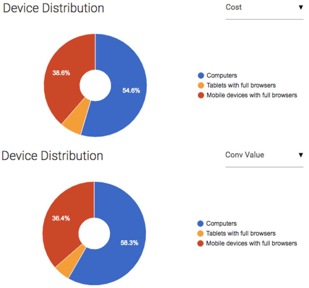
Consider these two visuals with device-level data for the same account and the same date range:
The pie charts above show that relatively little ad spend goes towards tablets, and since the slice of the blue pie for value is bigger than that for cost, it subtly says that CPA on computers is lower than for other devices. Overall, though, this visual says things are good.
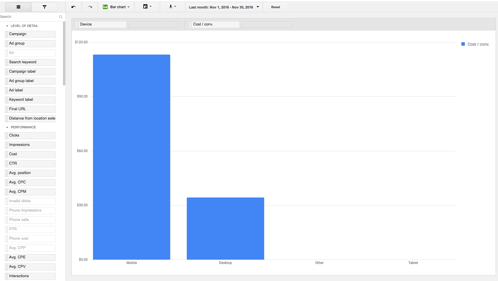
Now consider the following table which is using the same data:
The table highlights the fact that tablets have a terrible ROAS (Conv value/cost) compared to the other device types, but it says nothing about the relatively small portion of cost that goes toward tablets in the first place.
This visual may get someone all worked up that they’re spending too much money on tablets because they can’t see that tablets are just a small portion of the overall pie. Different visualizations of the same data can elicit vastly different reactions from the person reading the report.
It’s not easy to make a report that’s easy to understand and that clearly makes the right point, and clients may not appreciate the fact that a report that takes two seconds to understand probably took a whole lot more time to create.
But if we skimp on the time necessary to tell the right story with the right visuals, we may pay for it dearly in time spent afterward trying to restore the confidence lost.
3. Improperly segmented reports are useless
There’s a fine line to walk between sharing too much and too little detail, but as great marketers, we owe it to our clients to tell them stories with reports that are actionable at a level that’s useful to management, and that means we need to break our findings down by key segments.
Let me show an example of how some basic segmentation can totally change the story. Here’s an example visualization from our tool where we show what caused a change in conversions.
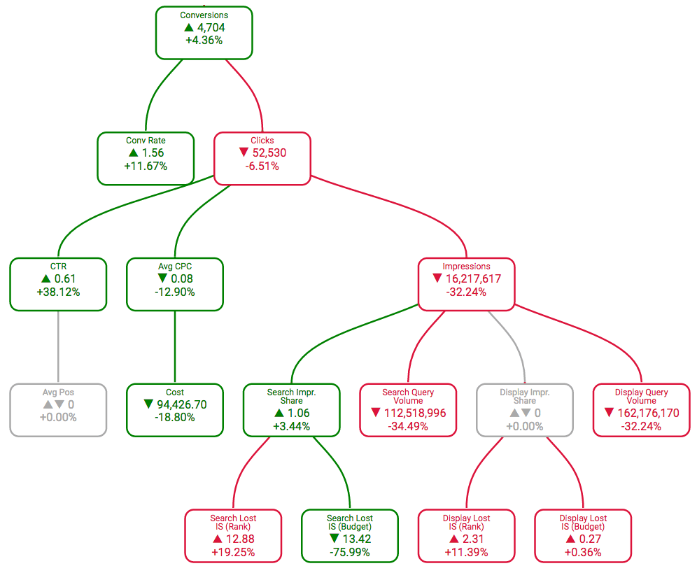
A cause tree that shows why conversions in an account have changed from one period to the next. Notice CTR is up 38 percent, but this data aggregates search and display, so we don’t really know what is driving this change. Screen shot from Optmyzr.com.
Notice that a difference in CTR was part of the reason. But we all know that CTR on search and display are vastly different, so this story is meaningless until we break out the two networks. Now we can see how CTR changed on search, a piece of information we can actually go and do something with.
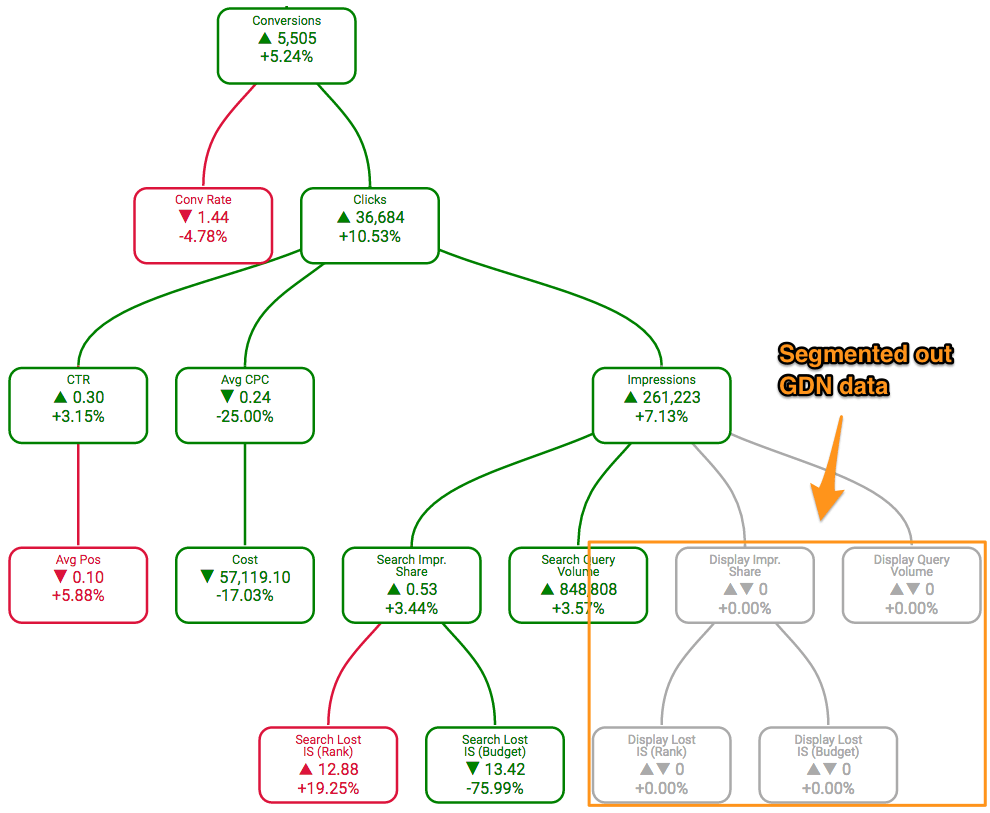
The same cause tree as above, but now excluding GDN data. Now we see that CTR is up just 3.15 percent instead of 38 percent, so most of the CTR gains came from GDN. This segmented data tells us a more useful story, specifically that an increase in relevant impressions was a more important driver for the overall increase in conversions on search results pages.
Some common segments you should include in reports:
-
Brand vs non-brand
-
Networks
-
Devices
-
Hour of week
-
Audiences
(Credit where it’s due: this point was also made by Jeff Baum from Hanapin Marketing in a webinar about reporting we recently co-hosted.)
4. Too much data + PPC newbie = disaster
Most people are not equipped to filter out the right information to make the best decisions in fields they’re not trained in. It could be that there is a lot of bad information (like fake news during the last election) or that there is so much data that it’s hard to put it together the right way to get the true story (like when patients incorrectly interpret medical search results).
PPC experts (who control the password to the AdWords account) are lucky that they usually control the lowest level of data and get to choose what the non-experts see, preventing them from coming up with questionable insights.
I’ve seen plenty of reports that are basically a data dump of everything in AdWords: lots of tables, data about every entity and page after page of eye charts. PPC experts are hired for their expertise, so they should focus reports for clients, stakeholders, and other non-PPC experts on the big findings and leave the details for themselves. That means creating brief reports that are focused on online marketing’s impact on the business.
For internal use, on the other hand, it can be helpful to get those more detailed reports because they help pinpoint what needs attention from the marketing team. For example, we have reporting widgets that show things like the most expensive ad groups that don’t have any ad tests running (that only include one text ad), or the highest CPA campaigns that have too few negative keywords.
By adding this data to an automated report, you can bypass the time-consuming step of generating the data and go straight to taking action. You’d almost never want to share this level of detail with a client, but it can be a big time-saver inside the PPC team.
5. Don’t take it personally when your report is ignored
Nobody gets excited about airbags in a car until one saves your life. PPC reports may not save lives, but they’re often similar in that they are ignored until there’s an emergency.
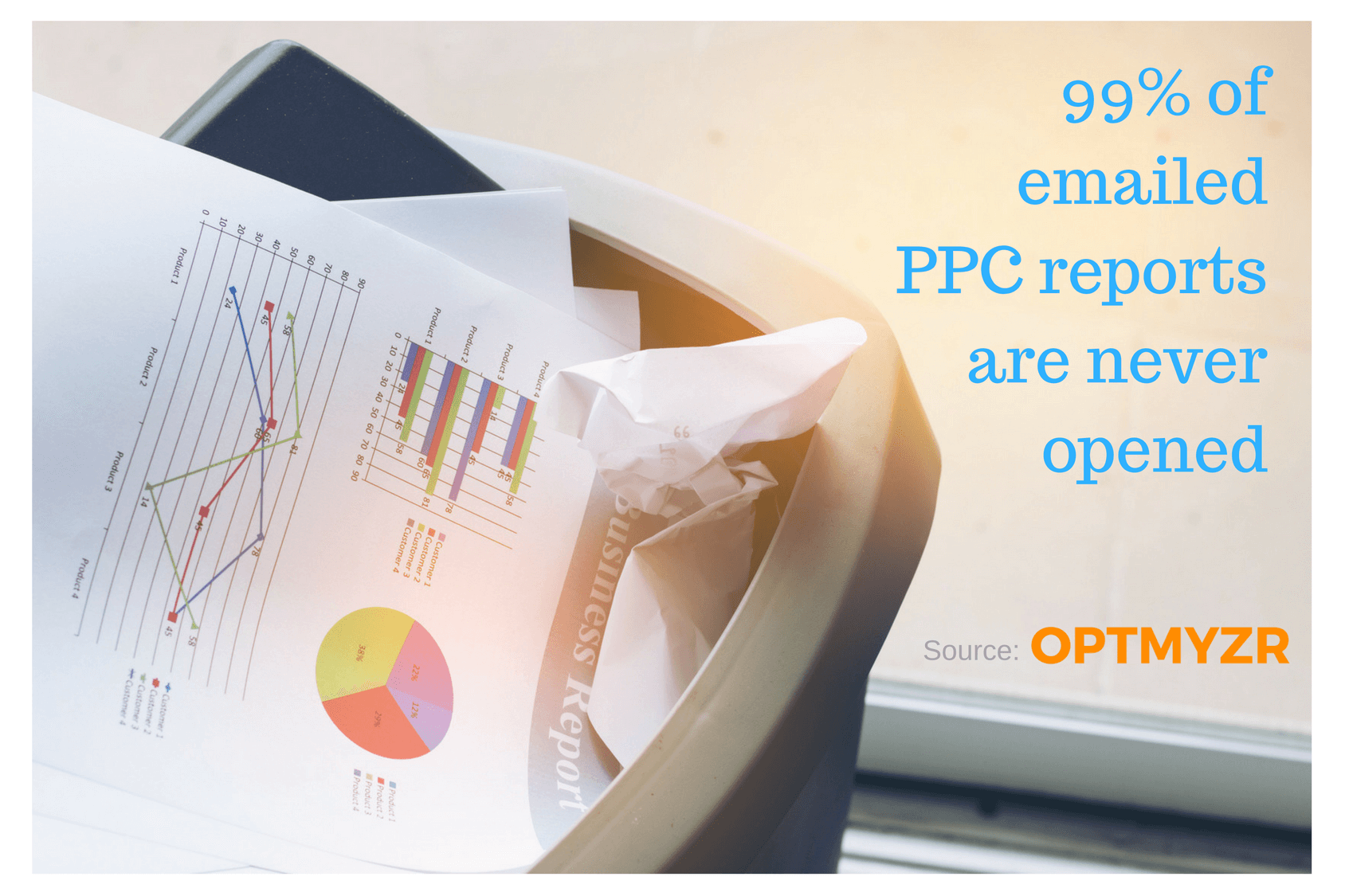
Optmyzr sends thousands of scheduled reports every month. Of all the reports we send by email, only 1 percent ever get opened by the recipient. I’m not totally surprised by this. When I was consulting, clients wanted to know that a report existed, but they didn’t necessarily care to look at it so long as things were going well and we covered the highlights in meetings.
You could argue that reports are mostly ignored because they’re not useful, but I had an experience that tells me this isn’t the reason. When I was consulting after leaving Google, I put a dashboard solution in place for my clients. Every client was excited to know there was a dashboard, but we sent an emailed invitation, 80 percent of them never bothered to accept the invite.
The fact that stakeholders never even looked at what we gave them tells me that the issue was not that we were providing irrelevant data, but simply that the average person is too busy to pay attention to something that seems to be going well. So if you feel your reports get ignored, take solace in the fact you’re hardly alone.
6. When you spend too much time on reports, your account management hours suffer
I just told you that your report will almost never get opened, but it’s still important to create a valuable report that answers all the right questions. Back to the airbag analogy: even though most people never see their airbag, when it gets deployed, it had better work as intended. Same with reports: when that emergency happens and the client takes a closer look, your reports are there to make it clear you’re on top of things with the account.
Ideally, you will get some sort of sign-off from the client when you first start working for them on what the reports will include.
I hear too many stories from agencies and consultants who get sucked into creating super-customized, overly granular reports. When getting hired to make an account better, it’s a distraction and a bad use of time to spend hours creating custom reports.
4 ways to automate reports
Unless you’ve been hired for your reporting expertise, the best use of your time is probably in strategizing about PPC and implementing optimizations. Reporting is necessary, but it should not be the focus and main use of your time.
So here are a few systems to help automate PPC reports:
AdWords reports
Upsides
- If you need some visual regenerated on a regular basis, AdWords Reports can now be scheduled, including pivot tables and charts.
- They’re free.
Downsides
- Can’t use this to create a report that includes several visuals.
- Only works with AW data.
GA dashboards
Upsides
- Can include data from other channels if you go through the cost import feature.
- Can include multiple visuals on a page.
- Free
Downsides
- Limited number of visuals can be included.
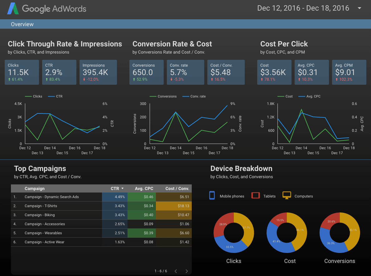
Google Data Studio
Upsides
- Connect data from the Google Cloud and many Google services.
- Ability to make interactive dashboards where the user can change the dates.
Downsides
- The free version is intended for individuals or small businesses. Agencies and enterprises will likely need to pay a hefty fee for usage.
Third-party reporting tools
Upsides
- Can connect to any channel, whether Google owns it or not.
- Tons of vendors with different capabilities and UIs providing lots of choice for users.
- Usually have a way to connect to your data.
Downsides
- These cost money.
Takeaways
So here are some bottom-line takeaways that should help you create more useful reports:
- Know how long conversions take to happen, and adjust your reports accordingly.
- Send monthly reports a few days into the new month rather than on the first to give reporting tools a chance to wrap up data collection.
- Include actionable segments in your reports.
- Keep reports for clients at the executive summary level and save the granular detail for the PPC team.
- Save old reports where clients can access them, even when they almost never look at the reports.
- Get sign-off on what your reports will include early on during the relationship with a new client.
- Automate reports to get more time for the fun part of the job: optimizing accounts.

