New Google Maps Adds More Search Results To Info Window
The (relatively) new Google Maps is certainly visually richer than the old Maps UI. However it may be somewhat less functional. As one example, it eliminates one of my favorite and most-used features: “search nearby.” It’s now also somewhat harder to access multiple results on a category query, ironically. Yesterday, Google Operating System spotted a […]
The (relatively) new Google Maps is certainly visually richer than the old Maps UI. However it may be somewhat less functional. As one example, it eliminates one of my favorite and most-used features: “search nearby.” It’s now also somewhat harder to access multiple results on a category query, ironically.
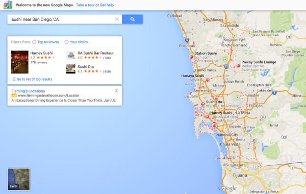
Yesterday, Google Operating System spotted a change in the number of search results showing in the main info-window below the search box. Google is now showing three results per category query. The following is an example result for “San Diego Sushi.”

Below is the same search result in the old Google Maps UI. Although more visually pedestrian, it’s more useful in several respects.

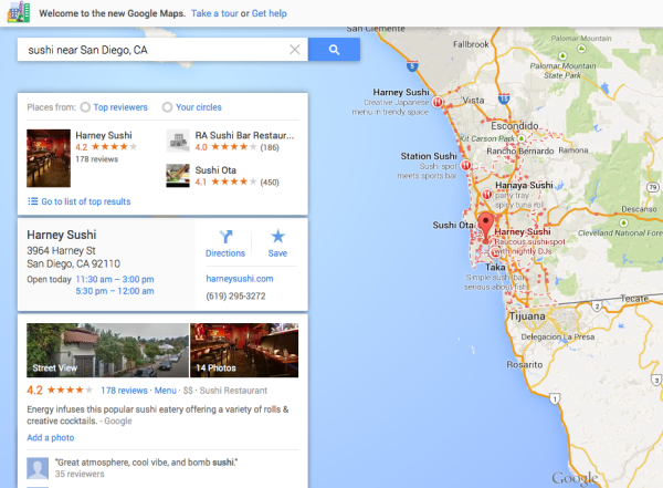
The following is a drill down on a single search result in the new Google Maps. The expanded result opens when users click on any of the links in the window.

Below is the old Maps UI. When one clicked on an individual result, an info-window or bubble appeared on the map itself.

Comparing the two views of individual listings on the old and new Maps UIs, it’s clear the new UI provides more information “at a glance.” However, as mentioned, users don’t get the “search nearby” feature, which I used frequently. I often used it, for example, to find a destination (e.g., conference location) and then identify nearby hotels or restaurants within walking or a short driving distance. (Note to Google: feature request.)
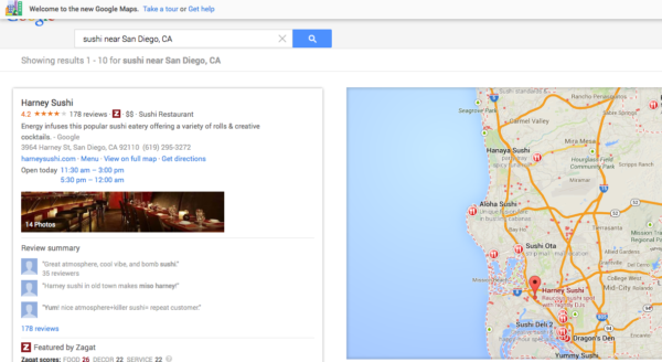
Below is the “list view” from the new Maps UI. It’s available after a click on “Go to Top Results.” Users can also drill down from this screen into individual business listings. These screens are more attractive and less cluttered than the old Maps UI list view. However they’re buried behind a click (or two clicks).
What’s very interesting is that Google+ is now harder to get to. Previously, in the old UI, clicking “more info” on any individual business listing took users to the Google+ Local page for that business. In the new UI, you get to the Google+ page for the business by clicking “reviews.” That’s not intuitive and effectively buries Google+. However it’s not clear that the majority of users would be seeking the Google+ listing for a business anyway.
Google Maps are increasingly a mobile-first product. My understanding, based on comScore data, is that since last year, there have been more mobile than PC users of Google Maps. By the same token, my sense is that the mapping segment may be “opening up” a bit. On the iPhone, Apple Maps has eaten into Google’s traffic.
In addition, the success of Waze (acquired by Google) suggests that it’s once again possible to launch a mapping app with a novel feature or twist and build a following.


